
What Is Graphic Design?

By Jonah Reed
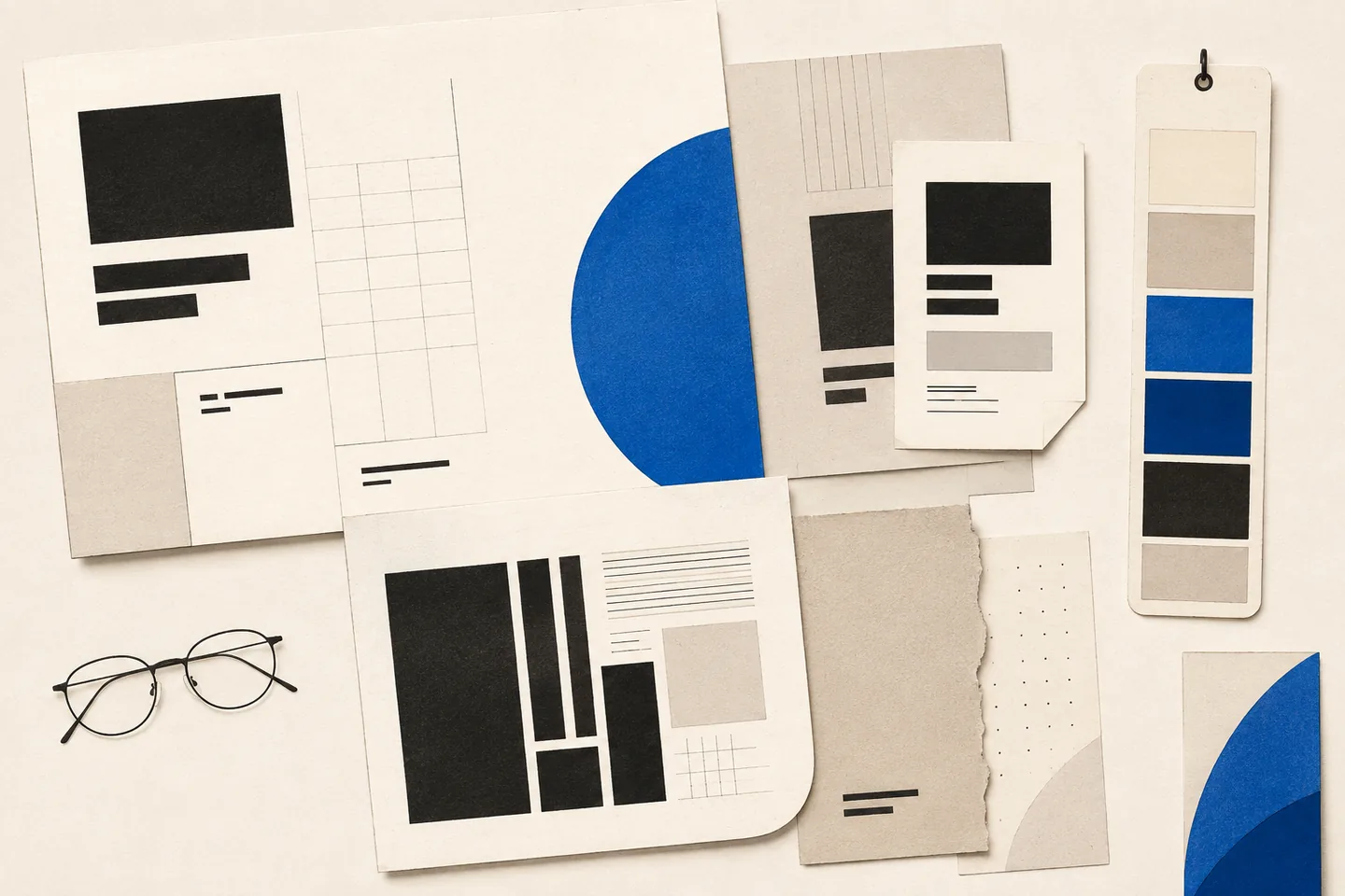
Graphic design is the practice of arranging words, images, colour, shape and space to communicate a message. It gives information a visible structure so people can recognise it, understand it and decide what to do next.
A poster, brochure, website or package has a particular job. It might explain a service, identify an organisation or guide someone through instructions. The designer works out what the audience needs, then chooses a visual approach that serves that purpose.
The American Institute of Graphic Arts describes design as planning and projecting ideas and experiences through visual and textual content. Planning matters because attractive work can still fail if its message is unclear or its essential details are difficult to find.
How visual communication works
Imagine a poster for a community workshop. Readers need to identify the activity, date, location and how to take part. A prominent title introduces the event; related details sit together; spacing separates practical information from the description. An illustration may explain the activity, but should not overwhelm the details.
Words supply meaning, while their presentation establishes emphasis and tone. Large type draws attention. Alignment connects separate elements. Colour can distinguish sections, and images can explain something that would take several sentences to describe. Layout determines the order in which readers encounter these elements.
These choices should reflect the viewing conditions. A poster seen across a room needs a different balance of detail and scale from a leaflet held in the hand. Shrinking the same layout rarely gives both formats equal clarity.
What does a graphic designer do?
A graphic designer turns a communication problem into a finished piece or a repeatable visual system. Work may include research, sketching, content organisation, image selection, typography, layout and production checks. The process starts with questions:
- What must the audience understand?
- Who will read or use the design?
- Where and at what size will it appear?
- Which information matters most?
- What should someone be able to do afterwards?
The answers form a brief. Required elements and wider goals are different: a brochure may need service descriptions and contact information, while its goal is to help readers choose the appropriate service. Both should guide the layout.
The designer explores concepts, compares them against the brief and refines the strongest direction. Refinement includes adjusting spacing, testing type sizes, simplifying imagery and removing unnecessary elements. Review should establish whether those choices solve the communication problem, rather than whether everyone shares the same taste.
The main areas of graphic design
Brand identity
Brand identity gives an organisation, product or service a recognisable visual presence. It can include a logo, type styles, colours, image treatments and guidance for using them together. A logo is only one component; the wider system helps separate materials feel related.
An identity must work in its intended settings. Test it as a small icon, on a document and in one colour where relevant. Details that look distinctive at presentation size may disappear when reproduced on a small label.
Print design
Print design covers books, leaflets, posters, menus, packaging and stationery. Paper, ink, folding, binding and image resolution influence the result. A folded leaflet needs a reading sequence that makes sense as it opens; a bound document needs enough inner margin to keep text comfortable to read.
Judge printed work as a physical object. A screen preview cannot fully reveal paper texture, the effect of a fold or whether small text remains legible in the intended lighting.
Digital design
Digital design includes websites, email layouts, presentations and screen interfaces. Layouts must accommodate different screen sizes and content lengths. A heading may wrap, navigation may collapse, and an image crop may change. A balanced static picture is only a starting point.
Accessibility affects those decisions. The World Wide Web Consortium’s accessibility guidance explains that content should be perceivable, operable, understandable, and robust. Meaningful headings, readable text, clear navigation, visible keyboard focus and text alternatives for informative images help people use the resulting design.
Editorial and information design
Editorial design organises longer content such as books, reports and magazines. Consistent headings, captions and page structures help readers find their place and distinguish the main argument from supporting material.
Information design applies that concern for clarity to instructions, maps, charts and schedules. Its task is to expose relationships and make details easy to compare. A timetable, for example, needs unambiguous labels and consistent alignment more than decorative variety.
Decisions that shape effective design
Audience and hierarchy
Consider what readers already know, their language and the circumstances in which they will encounter the message. A specialist report can assume knowledge that a public information leaflet must explain. Test those assumptions with readers where possible.
Hierarchy signals what to notice first, second and third through size, weight, position and spacing. Start with the essential message, then group supporting details beneath it. If every element is bold or brightly coloured, readers lose the cues that distinguish priorities.
Typography
Typography involves more than choosing a typeface. Size, line length, line spacing and paragraph breaks affect reading comfort. A narrow column may create awkward breaks; long lines can make the next line difficult to locate.
Use a small, consistent set of text styles with clear roles. Headings at the same level should look related. Check the actual content, including long titles, numbers and punctuation, rather than judging type from a short sample alone.
Colour and imagery
Colour can group information and direct attention, but it should not carry essential meaning alone. Pair a coloured warning with words or a recognisable symbol. Check text against its background, including text placed over photographs.
Give each image a purpose: explanation, identification or relevant atmosphere. Remove images that merely fill gaps. Check crops carefully so that useful details remain visible, and confirm permission to use the selected material before preparing final files.
Production and maintenance
Practical constraints belong in the brief. Printed work may require particular dimensions or finishing allowances. Digital work may need flexible layouts. A document intended for repeated use should remain understandable and editable by someone who did not create it.
Agree delivery formats early. An editable source file, a print-ready file and a compressed screen version serve different purposes. Clear names and brief usage notes help prevent the wrong version being used later.
How to prepare and review a project
Write a short brief covering purpose, audience, key message, required content, formats and limitations. If you supply reference designs, explain what is useful about them: perhaps their reading order, restrained colour or handling of dense information.
Gather approved text and images before final layout where possible. Missing content can change the structure, so identify unresolved details early. Name the reviewer and final approver to avoid contradictory revision requests.
Give feedback against the brief. Instead of asking vaguely for more impact, identify the problem: the main heading is hard to find, the instructions appear out of sequence or the image obscures a key detail. This gives the designer something concrete to resolve.
Before delivery, check the work in its intended setting:
- Read every heading, caption and instruction for accuracy and consistency.
- Print a physical proof of print work and inspect folds, margins and small text.
- View digital layouts at different sizes and test their links and keyboard navigation.
- Check image crops, text contrast and the reading order.
- Open the delivery files and confirm that the recipient can use the required formats.