
Graphic Design Examples

By Jonah Reed
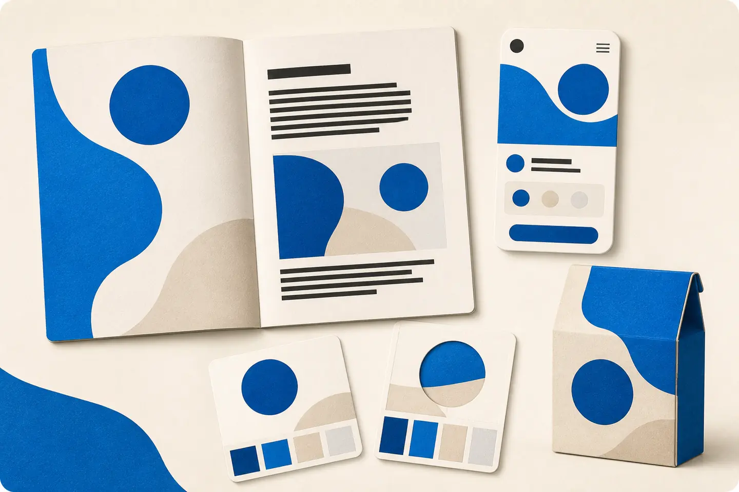
Graphic design is visual communication. It brings together type, colour, imagery, shape, space, and composition to present an idea or guide an audience toward an action. A logo can help people recognise a business. A brochure can explain a service. A website can organise information. Packaging can introduce a product before it is opened. A poster can make one message noticeable in a busy environment.
What Counts as a Graphic Design Example?
For example, a business card may need to make contact information easy to find. A product label may need to balance brand personality with practical details. A social media graphic may need to communicate its main point quickly on a small screen. A website may need to help visitors understand what a company does and where to go next.
Visual Identity Graphic Design Examples
Visual identity is one of the most familiar areas of graphic design. It includes the elements that help a business look recognisable and consistent across its communications. Examples include logos, colour palettes, typography choices, business cards, letterheads, signage, and brand guidelines.
A logo is only one part of an identity. It may serve as the most visible symbol, but the surrounding choices create much of the personality. A clean typeface, restrained colour palette, and generous spacing may suggest clarity and professionalism. Strong contrast, expressive lettering, and energetic shapes may create a more lively impression.
A useful identity system should work in more than one situation. Consider whether the logo remains legible at a small size, whether it works in one colour, and whether the chosen type and colours can be used consistently in both print and digital formats. A brand that looks good on a large screen may need different arrangements for a business card, profile image, invoice, or mobile interface.
Marketing and Advertising Design Examples
Marketing design turns a message into a visual invitation to pay attention. Common examples include flyers, brochures, postcards, email graphics, advertisements, event materials, sales sheets, and social media posts. These pieces may promote a product, explain a service, announce an event, or encourage someone to make contact.
The first consideration is the message. A design can contain many attractive elements and still leave the viewer uncertain about what is being offered. Start with one main idea. Decide what the audience should understand first, what supporting information they need next, and what action is appropriate at the end.
Hierarchy helps organise that sequence. A headline may establish the subject, an image may create context, and supporting copy may answer practical questions. A contact detail, button, date, or location can then provide the next step. The arrangement should make sense even when someone only glances at the design.
The principles of contrast, repetition, alignment, and proximity are useful here. A professional communication reference covers their use in hierarchy, grouping, and sequence. Its overview of visual communication elements explains how position, colour, size, shape, and orientation affect the relationship between graphic elements.
For a printed flyer, this might mean a strong headline, one clear image, short sections of text, and a visible response method. For an email graphic, it may mean designing a layout that remains understandable when viewed on a narrow screen. For an advertisement, it may mean reducing the number of competing messages so the central proposition remains clear.
Publication and Editorial Design Examples
Publication design focuses on longer-form reading. Examples include magazines, newsletters, reports, catalogues, books, menus, and digital editorial layouts. In these formats, graphic design has to support both interest and concentration.
Typography becomes especially important. Readers need to know where a section begins, how a caption relates to an image, and which information is primary or secondary. Consistent heading styles, sensible line lengths, and deliberate spacing can make a complicated document easier to navigate.
Images should contribute meaning rather than simply fill empty space. A photograph may introduce a subject, show a product, or provide an emotional point of entry. An illustration may simplify an idea or create a distinctive tone. Charts and diagrams should be organised so that the viewer can understand what is being compared or explained.
Publication design also requires attention to the final medium. A document intended for print may need different margins, image resolution, colour handling, and page structure from a document intended to be read on screen. A design should be checked in the form in which the audience will actually encounter it, not only in the design application.
Web and User Interface Design Examples
Web design and user interface design combine visual presentation with navigation and interaction. Examples include website pages, landing pages, online shops, dashboards, app screens, forms, menus, and buttons.
A visually appealing interface still needs to help people understand where they are and what they can do. Layout, spacing, labels, colour, and type should work together to establish a clear path. Repeated patterns can help users recognise similar actions, while carefully chosen differences can show which control or message deserves attention.
Accessibility is part of the design task, not an optional decoration. Text needs to remain readable against its background, including text placed over images or coloured panels. The W3C guidance on minimum contrast also explains why luminance contrast matters independently of hue and why text should be used instead of an image of text where possible.
In practical terms, check light and dark versions of a design, test text at the size at which it will be used, and avoid relying on colour alone to communicate meaning. A form error should not be identified only with red; a selected state should not be indicated only by a colour change. Clear labels, structure, and visible states help more people use the design successfully.
Packaging, Illustration, and Custom Artwork
Packaging is a graphic design example with both visual and physical responsibilities. Labels, boxes, bags, sleeves, and point-of-sale materials have to communicate while fitting a real object. The design may need to work across several sizes or product variations, and important information must remain legible when the package is viewed at an angle or placed beside competing products.
Illustration and custom artwork offer another route to originality. An illustration can give a campaign a distinctive voice, explain an abstract idea, or create a visual world that photography cannot provide. It can be used in editorial work, branding, packaging, posters, websites, and promotional materials.
Custom artwork should still have a clear role. A decorative style may support an identity, but it should not make essential information difficult to read. Consider how the artwork will be cropped, reproduced, resized, or adapted before committing to a final composition.
Motion design extends graphic design into animated logos, title sequences, explainer graphics, short videos, and social media animation. The same principles still apply: movement should clarify emphasis, reveal sequence, or add meaning. Motion that competes with the message can make a design harder to follow.
How to Evaluate Graphic Design Examples
Use these questions as a practical review:
- What is the main message?
- Who is expected to understand or use it?
- What does the viewer notice first?
- Is the information grouped in a logical way?
- Does the typography remain readable?
- Does the design work in its intended format?
- Can the identity be adapted without losing recognition?
- Is the next action clear where an action is required?
Practical Next Steps for Your Own Project
Begin by collecting examples according to purpose rather than style alone. Save one identity example, one print example, one digital example, and one example from a similar industry or audience. Note what each piece communicates effectively and which details may not suit your project.
Write a short design brief before choosing colours or fonts. Include the audience, message, format, required content, desired tone, and practical restrictions. If the project will appear in several places, list those applications from the beginning.
Then create a simple priority order for the content. Identify the headline, supporting information, essential details, and desired next step. This gives the design a structure before visual styling begins.
Finally, review the work in context. Print a print piece or view it at its intended size. Test a web graphic on a small screen. Check contrast and readability. Ask someone unfamiliar with the project what they notice first and what they think the design is asking them to do.