
As Design

By Jonah Reed
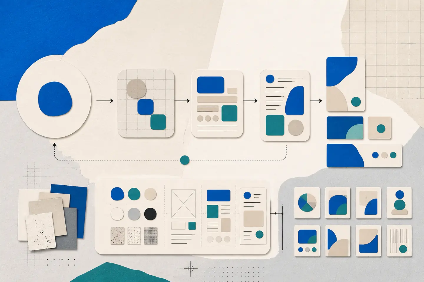
Design is a way to turn an unclear situation into a usable form. It applies to identities, documents, services, interfaces, objects and spaces. In each case, the work begins by deciding what a person needs to understand or do, then shaping information and interactions around that purpose.
This view keeps design grounded in use rather than decoration. Visual character matters, but colour, type, imagery and layout must support a clear task. Polish cannot compensate for confusing navigation, unreadable text or a broken process.
Start with the design question
A productive brief frames the problem before proposing a solution. Instead of asking for a new page, sign or identity, describe the situation that needs to change. Identify who encounters it, what they are trying to achieve and where the present experience breaks down.
Useful questions guide decisions while allowing several answers. “How can occasional visitors find the correct entrance after dark?” is more useful than “How should the new sign look?” It establishes a user, setting and task without choosing the form too early.
Record three connected parts of the question:
- Intent: the need or problem the work must address.
- Context: the physical, technical and organisational conditions around it.
- Use: what people must be able to understand, decide or complete.
A concept then provides the guiding logic for the response, while individual ideas suggest possible executions. The distinction matters because Design concepts and ideas serve different roles. A sound concept can support many coherent choices; an isolated idea may solve only one part of the brief.
Turn the question into a working brief
A brief should be short enough to use during critique. State the audience, desired outcome, required deliverables, constraints and approval process. Separate fixed requirements from preferences. A legal requirement, existing building dimension or supported device may be fixed; a preferred colour or layout usually remains open to testing.
Define success in observable terms. For a form, people should understand what information is required and recover from an error. For wayfinding, a first-time visitor should choose the correct route. For a report, readers should locate the conclusion and trace it to the evidence.
Also name the decision-maker and the moments when approval is required. This prevents late comments from silently changing the purpose of the work. When several stakeholders contribute, one person should consolidate feedback, resolve contradictions and return a prioritised response.
Gather evidence that can change a decision
Research should reduce uncertainty, not fill a presentation. Observe the current process, review support questions, examine existing content and speak with representative users where possible. Technical limits, accessibility needs, production methods and maintenance responsibilities determine whether a proposal can survive beyond launch.
Write each finding beside the decision it informs. If users repeatedly miss an instruction, it may affect hierarchy or wording. If a sign is read from a distance, it affects type size, contrast and message length. If editors update a page frequently, the layout must tolerate changing content rather than depend on one perfect sample.
Research rarely removes every uncertainty. Mark assumptions explicitly and choose a cheap way to test the riskiest ones. A paper sketch can test sequence, a content outline can test hierarchy, and a simple prototype can reveal whether controls and labels make sense before detailed production begins.
Develop and compare distinct concepts
Explore more than one direction before refining. The alternatives should differ in structure or approach, not merely in colour. One concept might shorten a process, another might reorganise information around user questions, and a third might change where or when guidance appears.
Compare each concept against the same criteria:
- Does it address the stated user need?
- Does it support the intended organisational outcome?
- Can it be produced and maintained within the known constraints?
- Does it introduce a new accessibility, privacy or operational problem?
Discard weak directions early. Refinement should strengthen the best response to the brief, not reward the option with the most finished-looking mock-up. Keep a short decision record explaining what was selected, what was rejected and which evidence shaped the choice.
Build a clear visual structure
Visual design determines what attracts attention, which elements appear related and what sequence a viewer follows. Size, contrast, spacing, alignment and placement should reveal the structure before decorative details are added. An overview of Visual design principles for UX describes how scale, hierarchy, balance, contrast and related principles help people interpret an interface.
Typography
Give each type style a job. A compact system may include a display style for the main message, heading levels for sections, a readable text style and a utility style for labels or controls. Create hierarchy through meaningful differences in size, weight and spacing. Small variations often create clutter without making the order clearer.
Check line length, spacing and paragraph width with realistic content. Text should remain readable when a heading wraps, a label grows or the viewport narrows. Keep essential information out of decorative type and all-capital passages.
Colour and contrast
Assign colour by role. Neutrals can support backgrounds and body text, a primary colour can identify main actions, and semantic colours can distinguish warnings or confirmations. Do not use colour alone to convey status; pair it with a label, icon or other visible cue.
Test contrast with small text, disabled controls and content over images. A clear-looking palette can fail when type becomes lighter or smaller. Use emphasis selectively: if every block is bright or bold, none provides a dependable focal point.
Layout and spacing
Alignment and proximity show relationships. Group a heading with the content it introduces, keep a label close to its field, and separate unrelated actions. Repeated margins and gaps create rhythm, while a deliberate break in that rhythm can signal a change of section or priority.
Design layouts for content variation rather than a single screenshot. Test short and long headings, missing optional fields, error messages and narrow screens. The reading order in the document should remain logical even when the visual arrangement changes.
Carry decisions across touchpoints
People often encounter an organisation through a sequence of materials rather than one page. A useful customer touchpoint architecture maps those encounters so teams can see where language, identity and behaviour need to remain consistent.
Consistency does not make every format identical. A digital form needs clear focus and error states; a printed guide needs readable type and a logical fold; a sign needs a short message visible at the required distance. The constraints differ, but terminology, priorities and next steps should agree.
- Digital: check keyboard order, control labels, responsive layouts and useful feedback.
- Print: confirm trim, bleed, paper, colour limits and the final reading size before production.
- Environmental: test viewing distance, lighting, placement and directions at real decision points.
Document reusable rules for logo placement, type hierarchy, colour roles, image treatment, interface states and tone of voice. State where variation is allowed. Guidance that explains the reason for a rule is easier to apply well than a collection of examples without context.
Make critique useful
Present work as a response to the agreed question. Restate the objective, explain the concept, connect major choices to evidence or constraints, and identify required decisions. This gives reviewers a basis for judgement beyond personal taste.
Ask focused questions. Instead of requesting general thoughts, ask whether the sequence matches the real task, whether a warning is visible soon enough or whether a proposed material suits its setting. Sort responses into three groups:
- Critical: blocks accuracy, access, safety or a fixed requirement.
- Important: improves clarity, consistency or maintainability.
- Optional: expresses a preference without affecting the agreed objective.
Test the revised work again when a change affects sequence, wording or interaction. A correction in one place can create a conflict elsewhere, especially when the same instruction appears across several touchpoints.
Measure, maintain and adapt
Evaluation starts with the original design question. Choose evidence suited to the task: completion and error patterns for a process, comprehension for information, route choices for wayfinding, or recurring support questions for a service. Quantitative evidence can show where behaviour changed; observation and conversation can help explain why.
Review the work after it has met ordinary conditions, not only in a controlled presentation. Record defects, recurring misunderstandings and exceptions to the design rules. Prioritise changes that prevent people from completing the main task, then address consistency and refinement.
A design system needs maintenance. Audit real use, remove patterns that no longer serve a purpose and add guidance when teams repeatedly solve the same problem. Keep the decision record with the design files so future changes can follow the original reasoning.